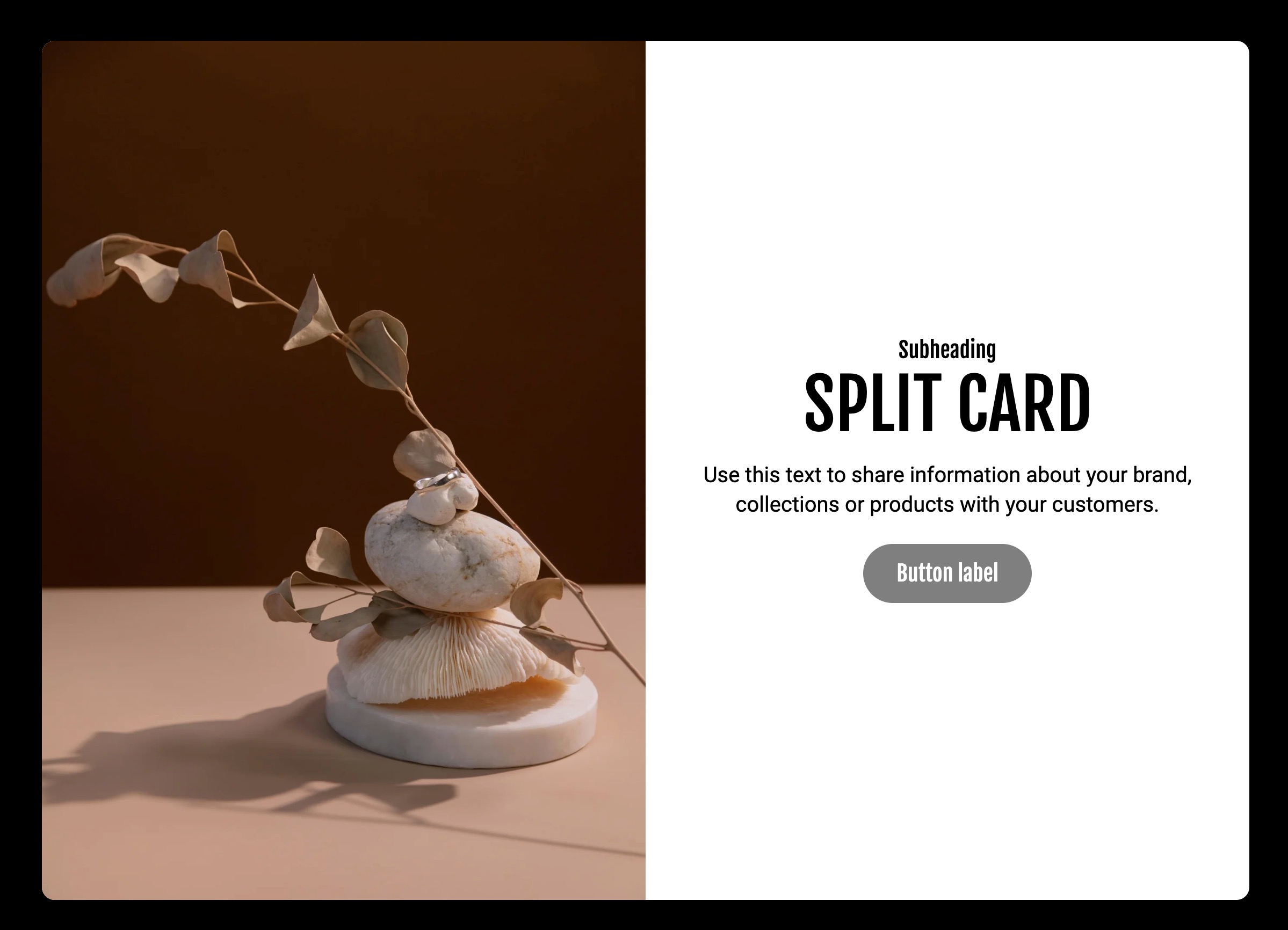
Split card with image banner and rich text blocks, border radius set to section

Split card with image banner and rich text blocks, border radius set to section
| Look 1: Border radius on the section (default) | Look 2: Border radius on the blocks | |
|---|---|---|
 |  | |
| Adds the border radius to the entire card, creating a split card look | Adds the border to blocks instead, allowing you to highlight one block in particular (keep the other block the same color as the background) |

The Composition preset features an image banner with a product banner, both with media padding offsetting the image from the border.

The Gloss preset features a shoppable video banner with collapsible content.

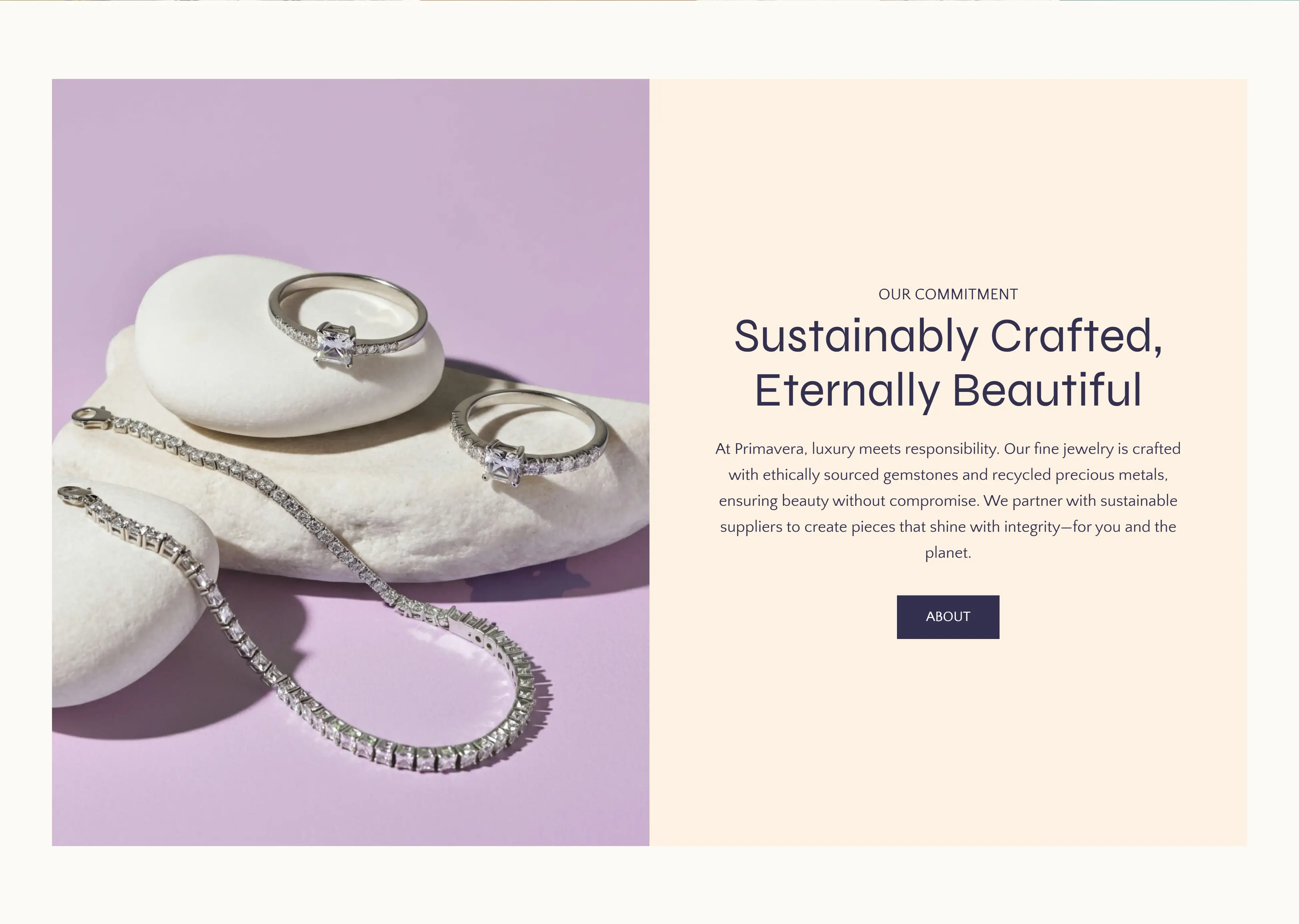
The Primavera preset features an image banner with a rich text section.

The Savoir preset features an image banner with a shoppable video banner.

The Gaia preset features a rich text block with a shoppable banner.

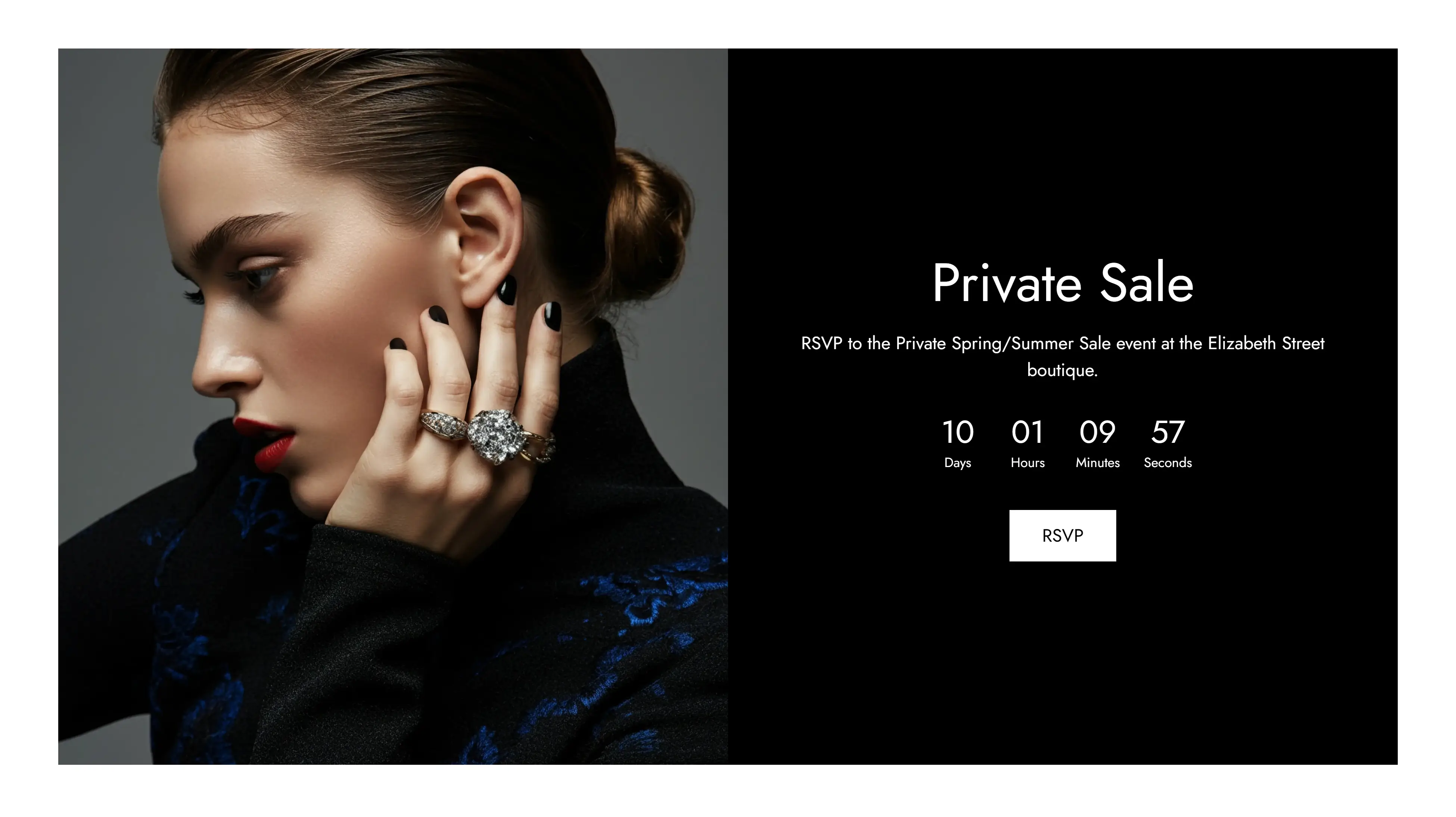
The Savoir preset features an image banner with a countdown timer.
| The split banner allows you to place any two blocks side by side without spacing on either side. | split-banner-gaia-2.webp |
| The richtext columns section allows you place blocks beside eachother without stretching the images to be equal height | Primavera Gloss 2025-04-02 at 5.07.07 pm.jpg |