LogoLogo
HomeTheme DocsSupportTry Primavera
  • Primavera Theme Docs
  • Guides
    • Quick start
    • Accessibility
    • SEO
    • How to set up the same homepage sections as the demo stores
    • How to add a mega menu
    • How to add a sidebar menu promotion
    • How to add product swatches
    • How to add a product subtitle/cutline
    • How to add product badges
    • How to add product recommendations
    • How to add an external video
    • How do I enable right-to-left support
  • Theme settings
    • Spacing
    • Appearance
    • Logo
    • Colors
    • Typography
    • Product card
    • Mini product
    • Collection card
    • Blog post card
    • Search behavaior
    • Social media
    • Currency format
    • Cart
    • Optimizations
    • Custom CSS
  • Sections
    • Announcement bar
    • Back to top
    • Banner grid
    • Before/after image
    • Bottom bar
    • Blog posts
    • Cart drawer
    • Collapsible content
    • Collection list
    • Contact form
    • Countdown timer
    • Custom liquid
    • External video
    • Featured collection
    • Featured post
    • Featured product
    • Footer
    • Header
    • Image banner
    • Image hotspot
    • Image with text
    • Logo list
    • Media grid
    • Multicolumn
    • Newsletter
    • Newsletter popup
    • Rich text
    • Rich text columns
    • Scrolling content
    • Search modal
    • Section header
    • Shoppable banner
    • Sidebar menu
    • Slideshow
    • Split banner
    • Split card
    • Stacked images with text
    • Testimonials
    • Video banner
    • Video with text
  • Blocks
    • Badges
    • Buttons
    • Card
    • Collapsible
    • Heading
    • Image
    • Liquid
    • Mini product
    • Page
    • Product
    • Text
    • Video
  • Templates
    • 404
    • Account
    • Blog
    • Blog post
    • Cart page
    • Collection
    • Collection list
    • Gift card
    • Home page
    • Product
    • Password
    • Search
  • FAQs
    • Why isn't my video autoplaying?
    • How do I edit the default theme content?
    • Where do newsletter signups go?
    • Why are my images cropped?
    • How can I change the meta color?
  • Advanced
    • Customizing code
    • JavaScript events
    • How to refresh the cart using JavaScript
    • Use a custom font
  • Contact support
Powered by GitBook
On this page
  • Settings
  • Mega menu blocks
  • FAQ
  1. Sections

Header

The main navigation for the site is found in the header section.

PreviousFooterNextImage banner

Last updated 19 days ago

The header mostly contains settings related to the header bar itself and the desktop menus. Settings for the mobile navigation can be found in the section.

Quick start

  • Create your desktop menu in Content > Menus, then select a desktop menu in the Customizer

  • Choose your preferred layout (horizontal or vertical)

  • Decide if you want to use icons or text for secondary menu items (cart, login)

  • If you want to add mega menus,

Settings

  • Layout:

    • Layout (desktop): Choose between two different header styles on larger screens. On smaller screens, the header menu will always have the sidebar menu trigger on the right, and the logo in the center.

      • The horizontal desktop layout features the main menu on the left, the logo in the center, and the secondary menu on the right.

        • The vertical desktop layout features the site logo on the left, the main menu in the center and the secondary menu on the right. Both menu types support dropdown and mega menus, but we recommend the horizontal desktop layout if you have a lot of top level links.

    • Sticky header type: The sticky behaviors are none, always and on scroll up. These options describe the conditions under which the sticky header is active. If you are using the vertical desktop layout or your header height is tall, we don't recommend using the always option as it may take up too much vertical space.

    • Use icons instead of text: Converts secondary menu links (such as the cart and login/account links) to be displayed as icons on the desktop layout.

    • Enable mega menu overlay: Adds an overlay to cover the rest of the site when a mega menu is open. This will only apply for mega menus, not regular dropdowns.

  • Transparent header:

    • Enable transparent header: The header background becomes transparent when certain conditions are fulfilled. The first section on each page must be an imagery based section, such as a slideshow, image, or video banner section, in order for the header to be transparent. You can apply a specific color for the transparent header in the colors subsection.

    • Enable blur on scroll: Adds a subtle background blur behind the header only when it is transparent, creating a frosted glass effect on scroll

    • Text: Choose the foreground color. For example, if you know that you'll be using only darker images underneath the transparent header, keep it as white (#FFFFFF).

  • Borders: Enable to create more separation between your header and the rest of the page

Mega menu blocks

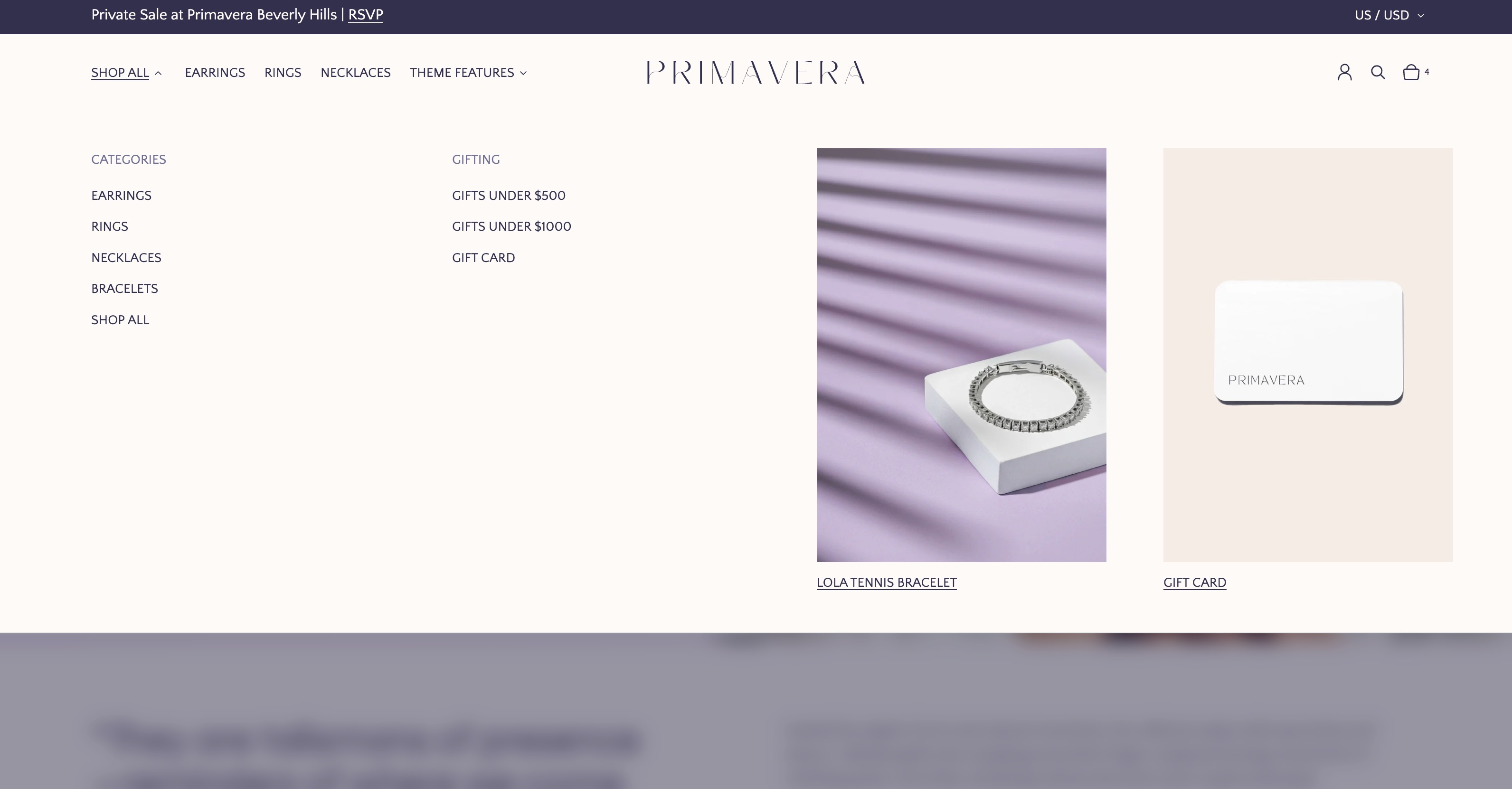
A mega menu is a way to display dropdown links in a more visually engaging way. Use mega menu blocks when you wish to create hierarchy or draw attention to certain links on your site with imagery in addition to text

To convert a regular dropdown in to a mega menu:

  1. Add a new mega menu block

  2. Type the name of the item you wish to be a Mega menu in the menu item field. This must match exactly, including whitespace and casing. The dropdown items for this link will be used to populate the mega menu.

  3. Choose a color scheme

  4. There are two different layout options for the mega menu, which only apply if an additional color scheme is used. When the fade layout is selected, the mega menu will fade to match the new color scheme. When the split layout is applied, the mega menu will be split in half, with one half using the original color scheme and the other using the new color scheme.

  5. When using the vertical header and the fade mega menu, there is a chance that you may have color contrast issues with your original logo. In that case, upload a logo with a different color scheme under Settings > Logo > Alternate logo and enable the use alternate logo checkbox to switch logos when the mega menu is active.

  6. Add up to 3 promotion blocks. For each promotion:

    1. Image

    2. Image ratio

    3. Label

    4. Link

FAQ

Why can I only see the hamburger menu on desktop?

If your screen is on the smaller size or you've zoomed in, you might not be able to preview the desktop menu initially due to the customizer sidebar width. The breakpoint for the header is approximately 1216px (subject to your default font size), so smaller desktop screens may need to zoom out to see the correct layout. To zoom out, press control/command and the minus (-) key simultaneously on your keybard.

Desktop menu: and add it here. The theme will automatically create a nested navigation based on the menu structure, but you may wish to create more visually interesting menus by creating a mega menu block (see below).

Use alternate logo: Enable this to display the specified in theme settings.

Color scheme: See

Padding: See

Create a menu
common settings
common settings
sidebar menu
follow this guide
Header on the Distinction demo store, with a mega menu block assigned to "Shop"
Precision uses two mega menu blocks on desktop: one for Shop All and one for Theme Features
alternate logo